Centre Church

A new name and brand for a church in the centre of the city
For over 10 years, westside church has been an anchor presence in the city. Meeting the needs of the marginalized, and creating a space for thousands to gather to worship and serve the city. As a new chapter has been unfolding, there was a need for a new name and visual identity to help move this community of faith into what is next.
A storied past. An unfolding future.
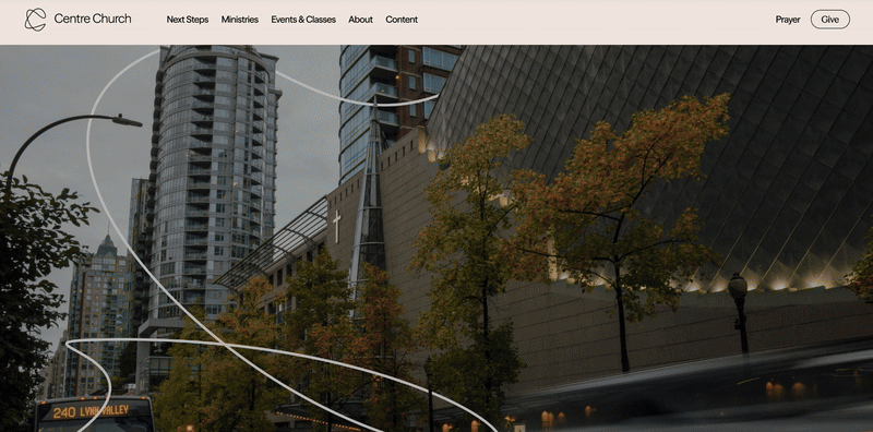
Westside church has been a source of stability and an anchor within the church in Vancouver. As they moved from the west side of the city into their new building - The Centre for Perfoming Arts in the centre of the city, there was a pull towards a new name that better told the story of who they are and where they are going, all with Jesus as the centre.
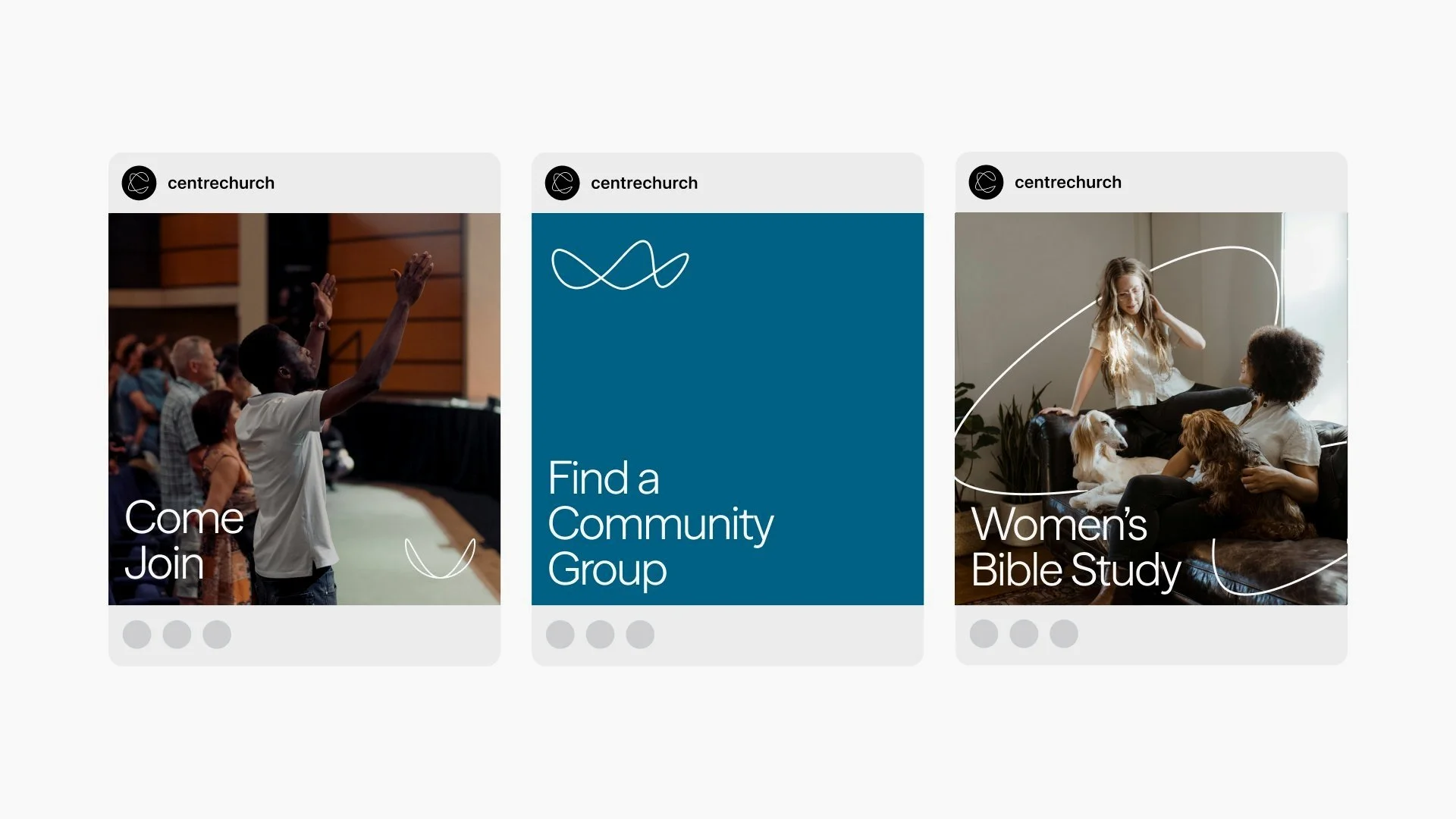
A living, breathing brand.
Through a deep discovery process and exploration, we were able to uncover a brand system that was tethered to their vision (word + spirit) as well as their core values (prayer, gospel, priesthood). All woven together with a living, breathing brand ”fibre” that connects all of them back to their core logo mark and visual identity and applied across all brand expressions. To learn more, visit Centre Church.


Colours + Shapes felt like what I would hope a ‘creative partner’ would feel like. They sat with us from the beginning and listened well, asked great questions and ultimately, were able to bring to life something that beautifully captures the vision of who we are.
Matt Menzel
LEAD PASTOR, CENTRE CHURCH