Break Forth One
- Event Producer
- Production & Stage Design
- Technical Design
- Branding
- Event Trailer
- Visual Content
Break Forth One exists to unify, serve, equip and empower the church in Canada to live out the mission of Jesus.
For more than 20 years, Break Forth has been the largest church conference in Canada. In 2016 they approached us to help them begin to transition their event towards a new vision. We’ve spent the last three years partnering with them to see that dream realized.
The challenge: How to best partner with a non-profit that has big dreams and ambitions but limited resources to help them deliver a world class event – that impacts not only those in the room, but the entire country.
Design
After helping them work through a name change (from Break Forth to Break Forth One) and a rebrand, the key goal for 2019 was to help people grab hold of the new vision of Break Forth One by highlighting the four pillars of their vision statement: unify, serve, equip and empower. This is the heartbeat of the event.
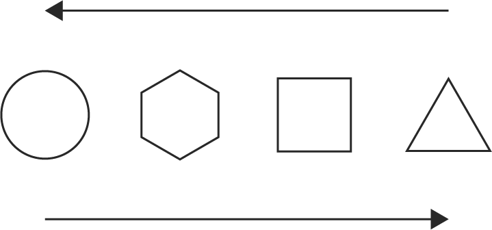
The approach we came up with was to represent each of the four pillars with a symbol.
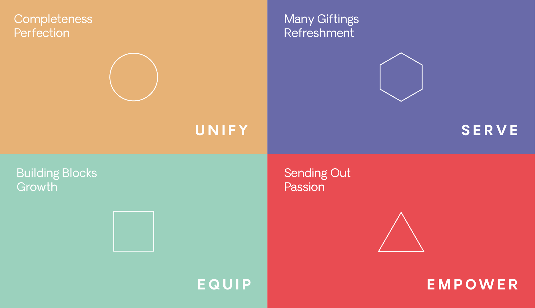
As a unit, the icon set forms a progression from “less sides” to “more sides”, painting a picture of the journey towards unity, completeness, and becoming ONE. Moving in the other direction, the icon order can signify the movement from Unity towards Sending: when we are working together in unity, bringing each of our unique gifts to serve one another, we can be equipped for service and sent out on Jesus’ mission.
We also chose to reinforce the four pillar words through colour, bringing them to life by incorporating them into a set of beautiful gradients. The inspiration for the swirling nature of the gradients was birthed out of a desire to represent the concept of unity as when “we’re all moving rhythmically and easily with each other” (Ephesians 4:11-13, MSG).
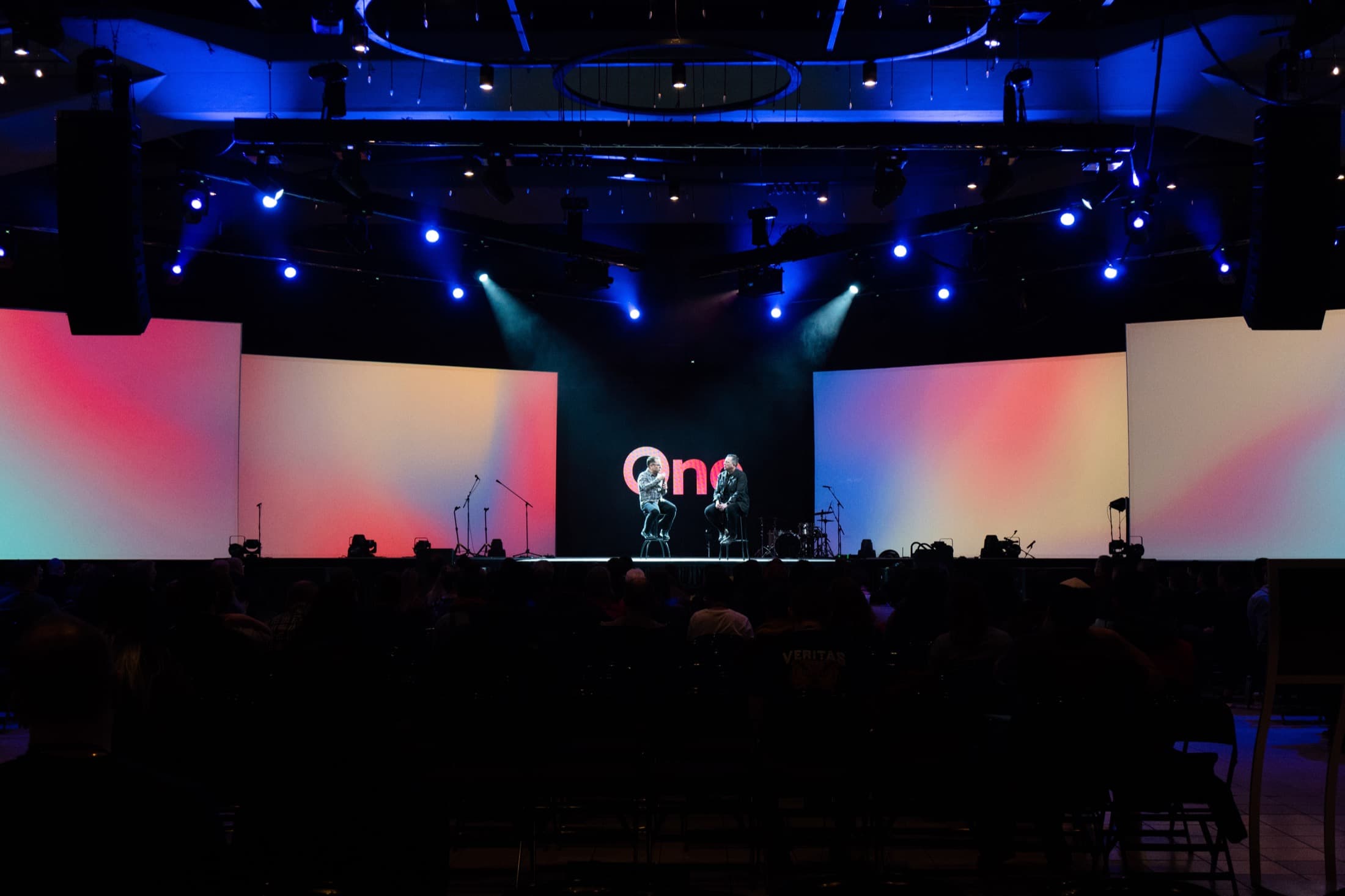


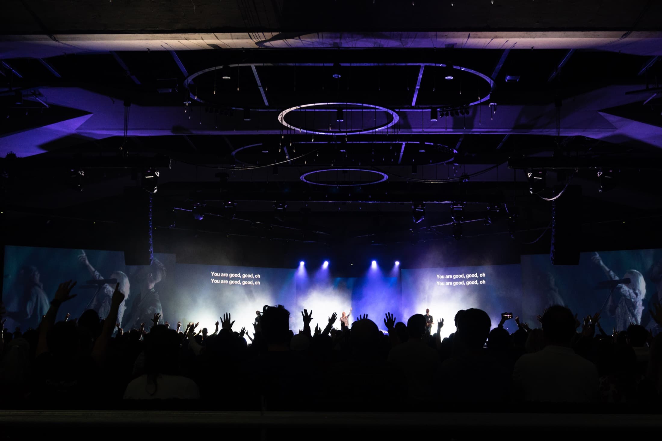
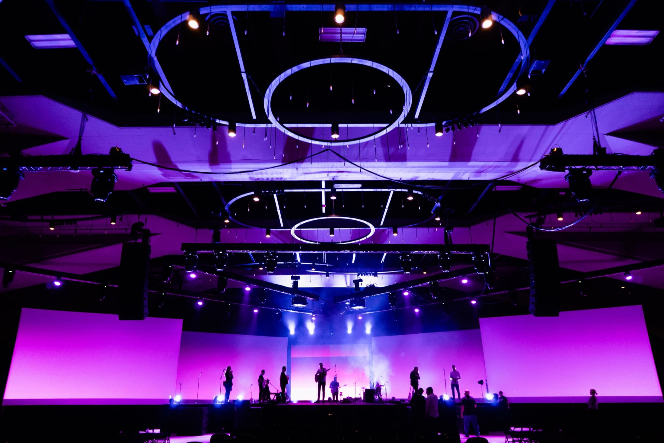
Production
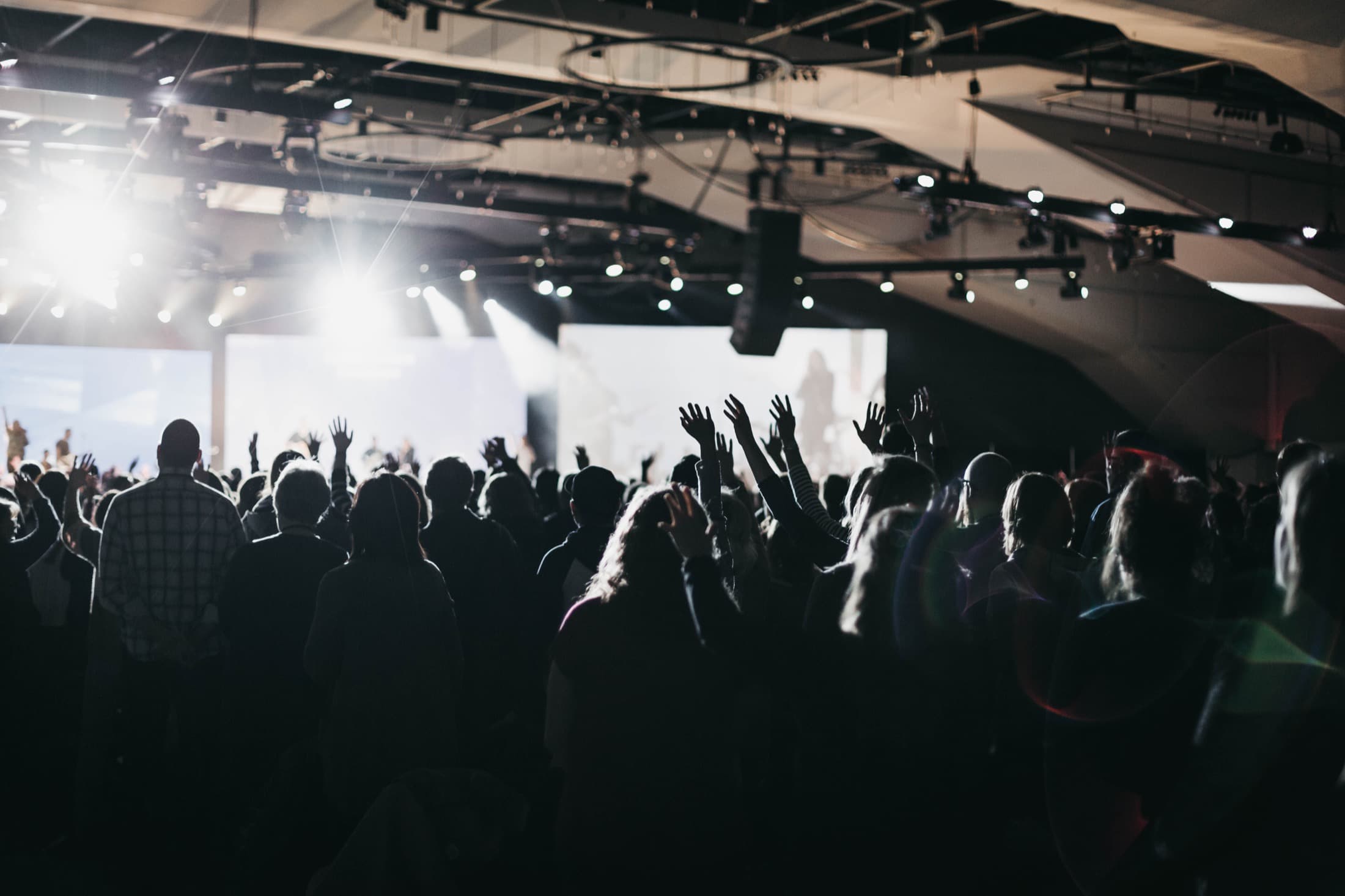
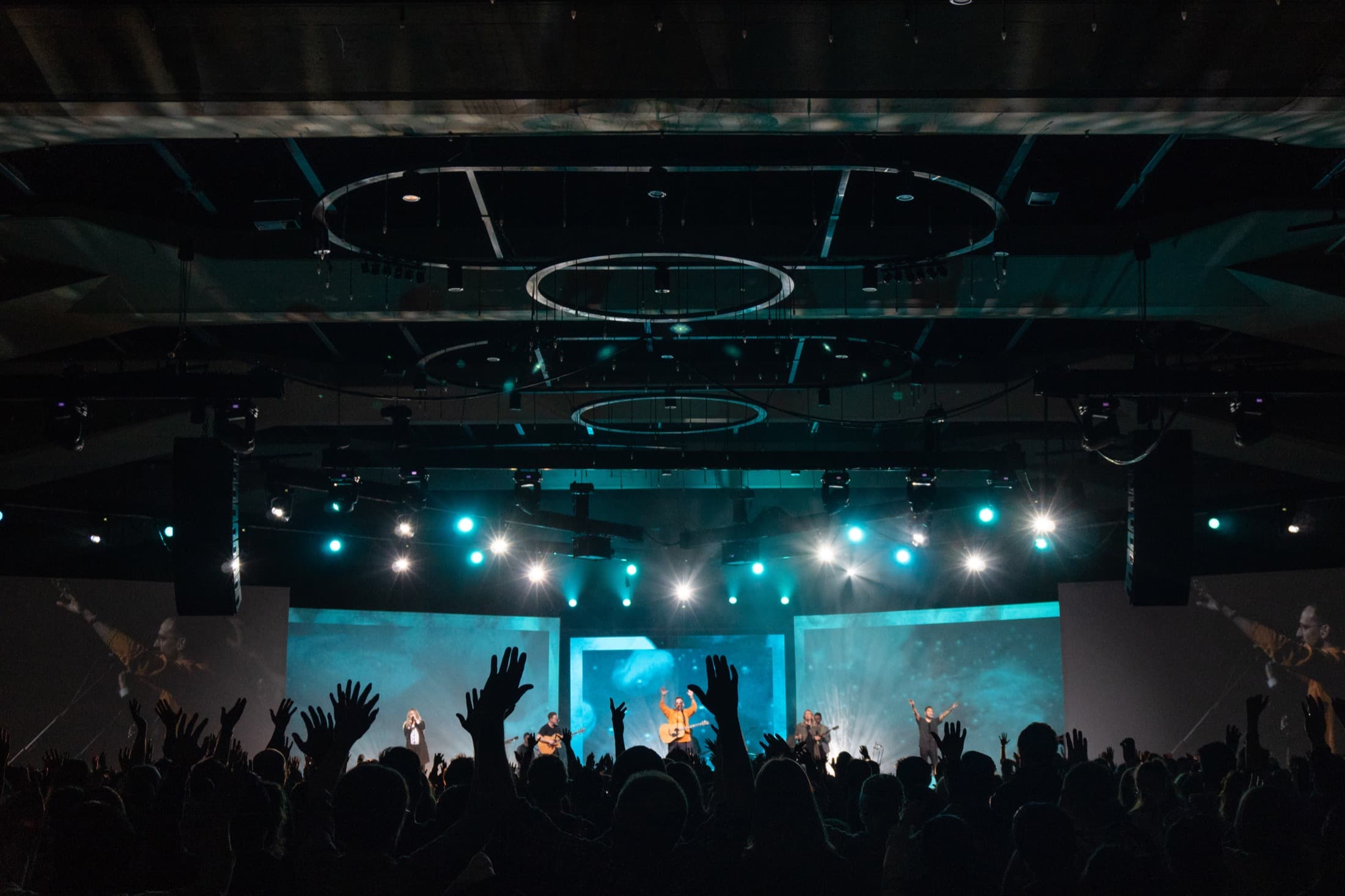
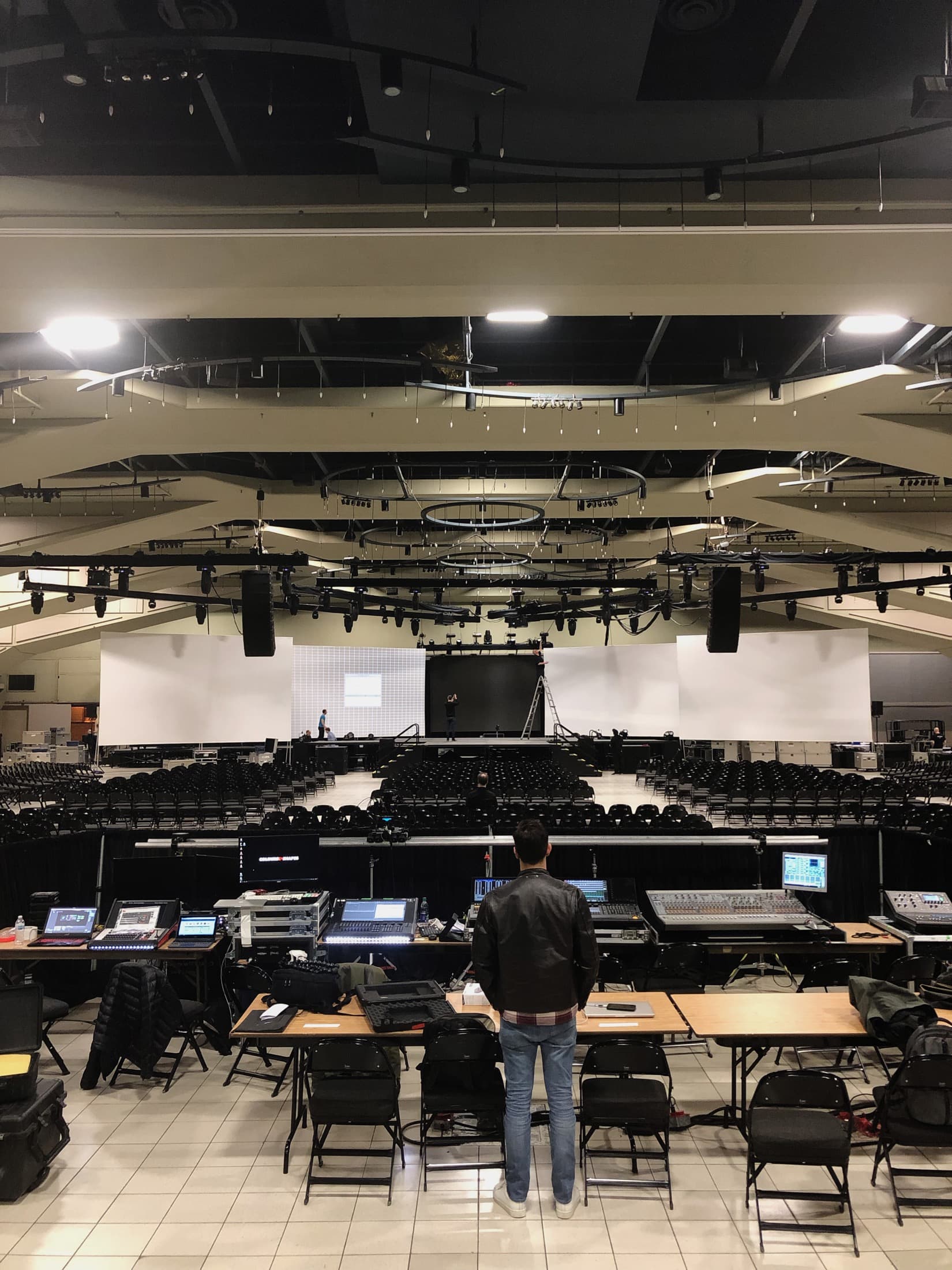
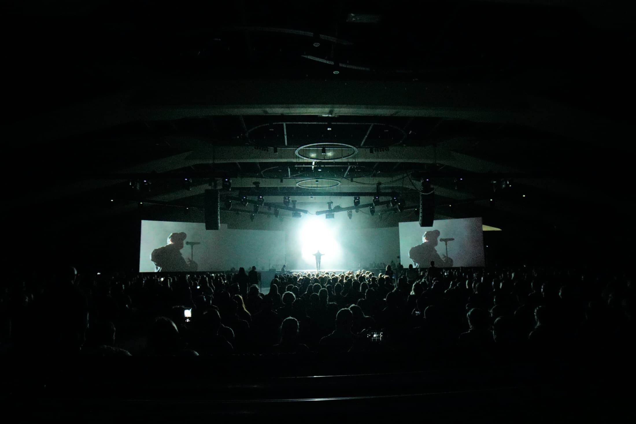
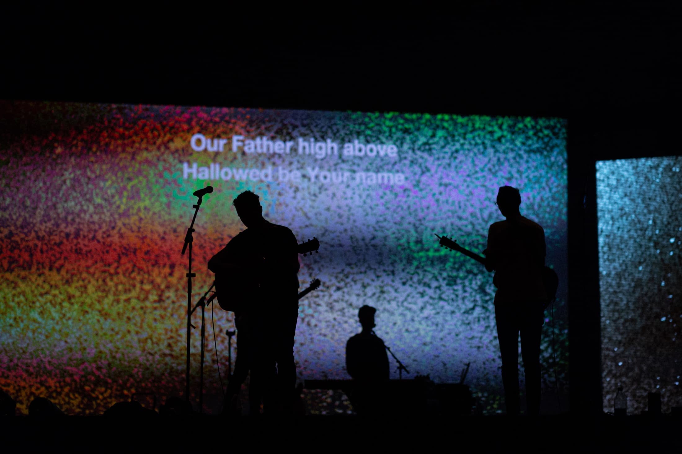
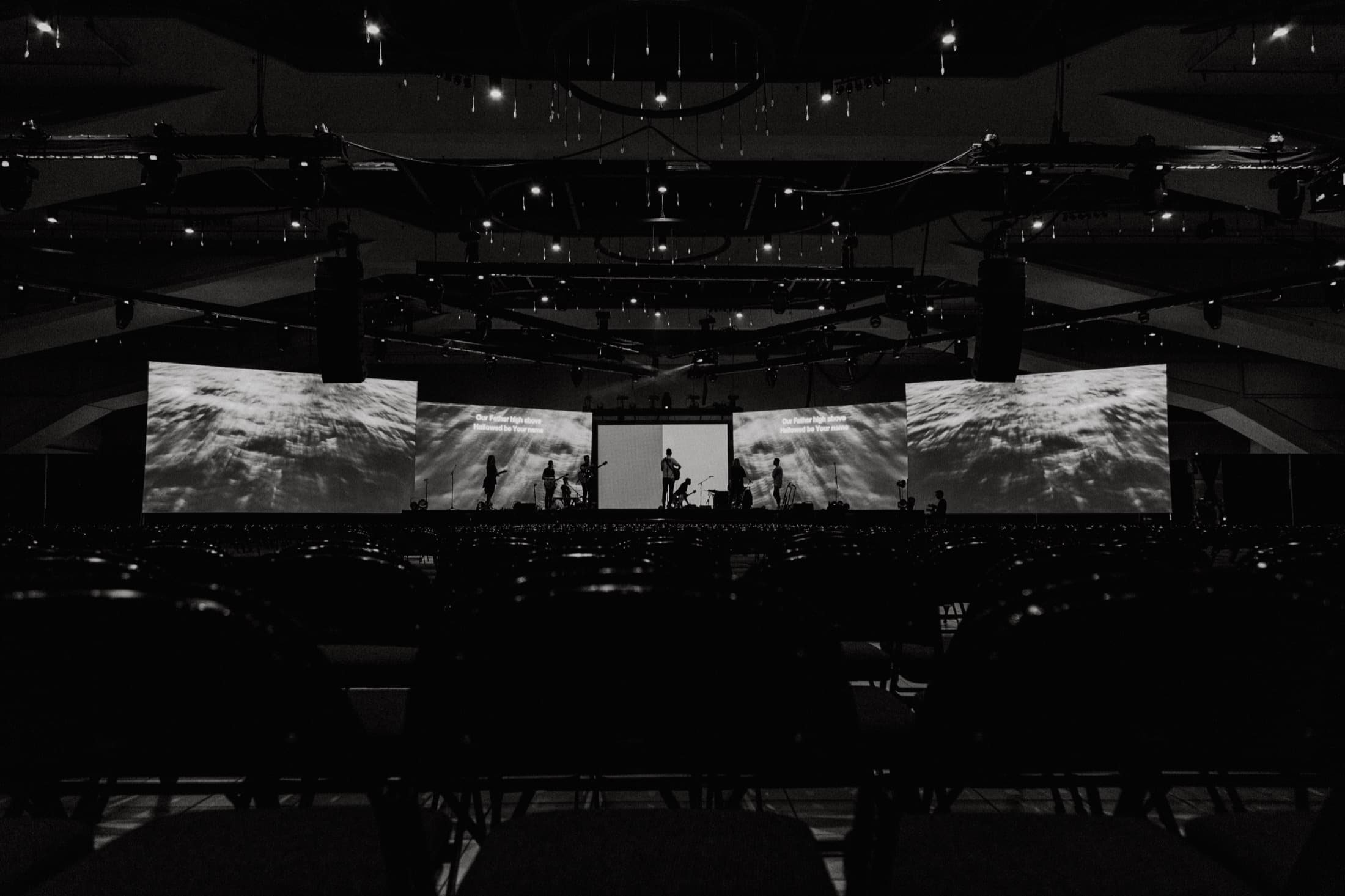
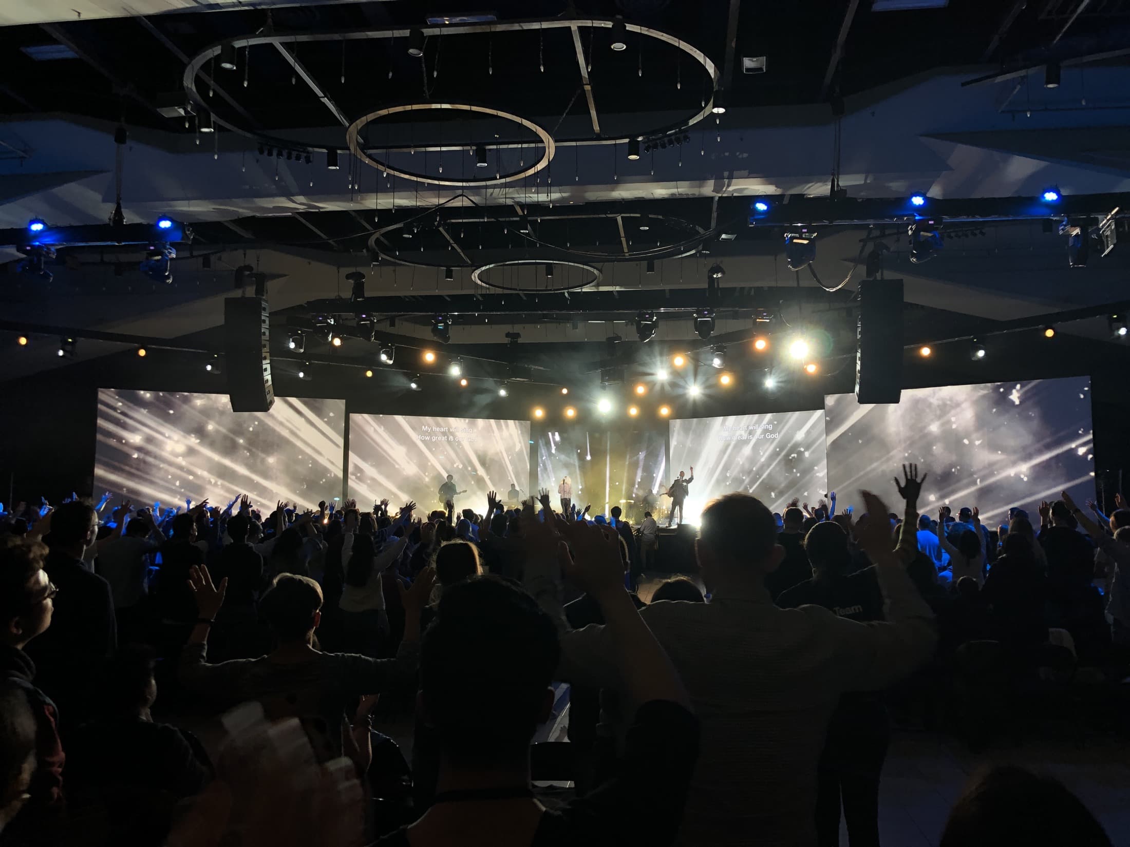
When it came to producing the event itself we were faced with a number of challenges, from limitations on what was possible in the room to a very diverse audience with diverse desires. Above all, our aim was to create the best possible experience for all who attended the event. In designing and executing the production for 2019 we used both feedback collected from attendees as well as our experiences from the the previous years. Our main focus was to achieve excellent sound quality and comfortable sight lines from every seat in the house.
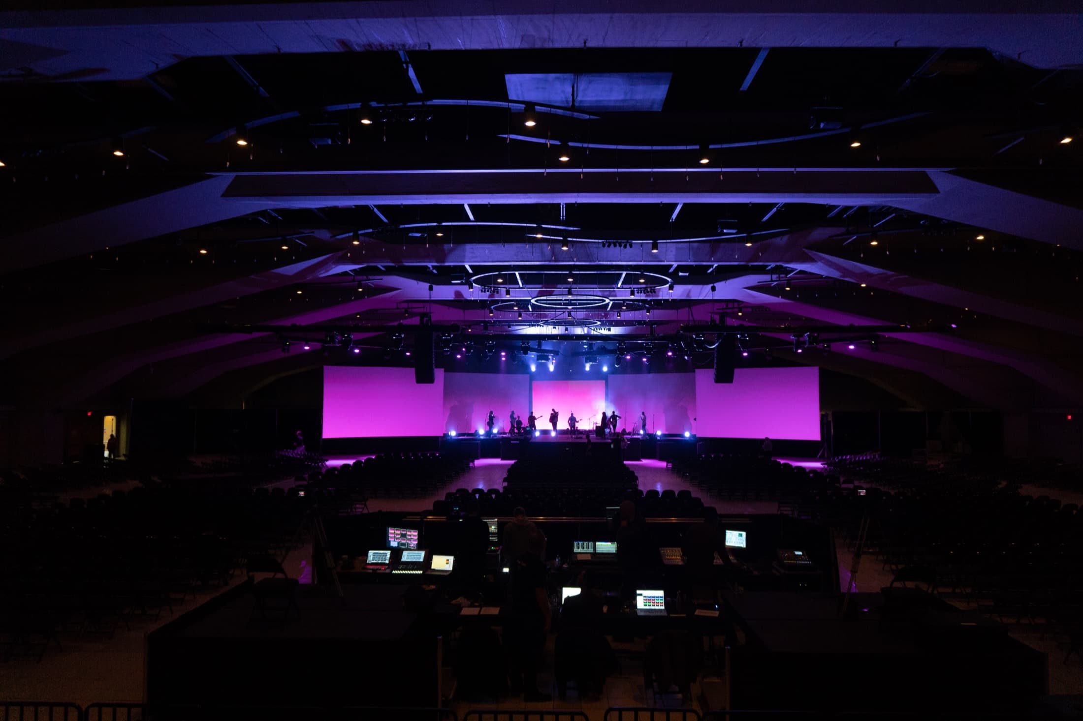
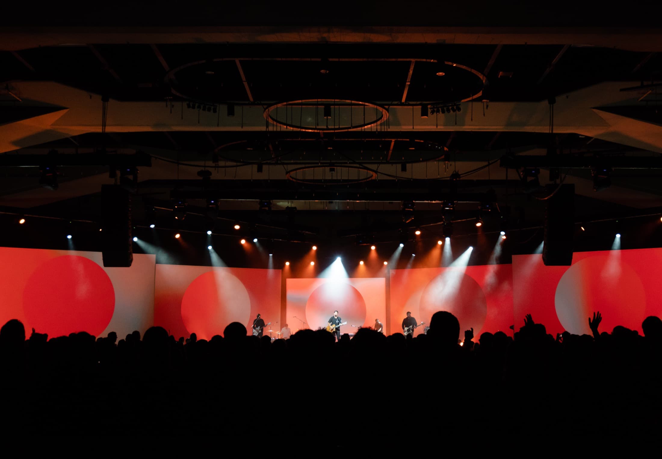
The stage was designed to embrace and capitalize on the shape of the room as well as reinforce the four pillar words through the use of four projection screens. By placing the screens at strategic angles we were able to eliminate the problem of any less than ideal sight lines.
The Results
Another piece we were able to help them achieve at this year’s event was the capture of content for online distribution beyond the event itself. With a new name, brand, vision and communications strategy, Break Forth One is now in the planning stages of launching an online channel, podcast, and more.
Partnering with Colours and Shapes has been the best decision we could have made for our event. Working with us on everything from curation, brand, programming, design, production, vision, planning, budgeting, and so much more — they truly have been the best kind of partner you could hope for.
Sharol Josephson
Executive Director, Break Forth One